YouTube is launching what the company calls the biggest redesign in its history today, including sweeping changes to its homepage and channel pages. The goal is better personalized video discovery and viewing, with a notable emphasis on social features. Think of the changes as the latest example of Google’s campaign to create a unified social layer for all of its products.
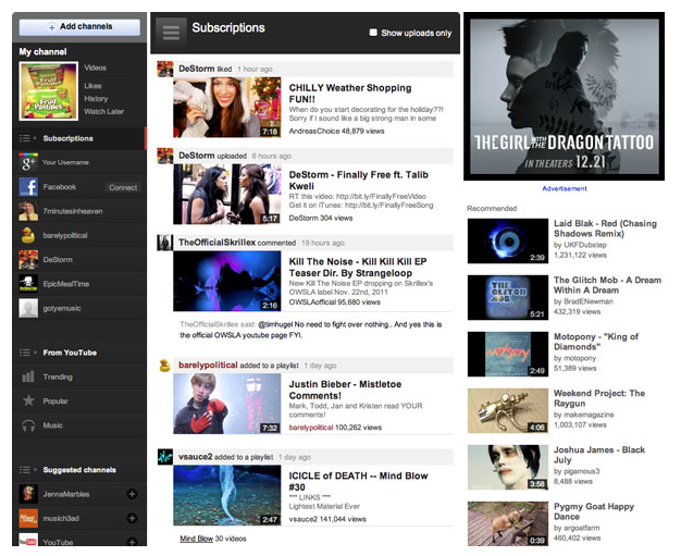
The new homepage looks a lot like Facebook, or Google+ for that matter. An activity feed view dominates the middle of the page, while a left-hand navigation bar provides a set of filters for what you see in the feed.
The default Subscriptions feed appears to include algorithmically determined video uploads and activities determined by information like what videos you’ve watched and which channels you’ve subscribed to, although YouTube group product manager Noam Lovinsky wouldn’t tell me exactly how it worked. The previous version of the homepage feed, which launched early this year, doesn’t appear to be algorithmically tuned to the same degree.

G+ and Facebook also get prime-time spots in the navigation bar, listed right beneath the first feed. Click on either and you’ll be able to view videos shared by friends on those networks. G+ videos are automatically in there since YouTube accounts are linked to users Google identities. Facebook requires an opt-in login.
Google is playing up the already social aspects of YouTube to help it bolster Google’s cross-product G+ push. The Facebook integration is a bit more surprising considering that it’s the main social competitor out there. But Lovinksy downplayed that point when I brought it up, noting that only around 10% of YouTube’s views are from embeds, meaning that Facebook is just a part of that percentage.
He went on to explain that the prominent locations for G+ and Facebook are to help with onboarding for newer users. Instead of looking through the entire site for interesting channels, or trying to see what YouTube’s general recommendations tell them, they can get started by seeing what their current friends are already sharing.
The rest of the left-hand bar includes other options for filtering the feed. You can pin any subscribed channel to the top section as well. Click on any of those subscriptions and you’ll see a reverse-chronological feed of all the activity in that channel.
The new homepage looks a lot like Facebook, or Google+ for that matter. An activity feed view dominates the middle of the page, while a left-hand navigation bar provides a set of filters for what you see in the feed.
The default Subscriptions feed appears to include algorithmically determined video uploads and activities determined by information like what videos you’ve watched and which channels you’ve subscribed to, although YouTube group product manager Noam Lovinsky wouldn’t tell me exactly how it worked. The previous version of the homepage feed, which launched early this year, doesn’t appear to be algorithmically tuned to the same degree.

G+ and Facebook also get prime-time spots in the navigation bar, listed right beneath the first feed. Click on either and you’ll be able to view videos shared by friends on those networks. G+ videos are automatically in there since YouTube accounts are linked to users Google identities. Facebook requires an opt-in login.
Google is playing up the already social aspects of YouTube to help it bolster Google’s cross-product G+ push. The Facebook integration is a bit more surprising considering that it’s the main social competitor out there. But Lovinksy downplayed that point when I brought it up, noting that only around 10% of YouTube’s views are from embeds, meaning that Facebook is just a part of that percentage.
He went on to explain that the prominent locations for G+ and Facebook are to help with onboarding for newer users. Instead of looking through the entire site for interesting channels, or trying to see what YouTube’s general recommendations tell them, they can get started by seeing what their current friends are already sharing.
The rest of the left-hand bar includes other options for filtering the feed. You can pin any subscribed channel to the top section as well. Click on any of those subscriptions and you’ll see a reverse-chronological feed of all the activity in that channel.
The rest of the left-hand bar includes other options for filtering the feed. You can pin any subscribed channel to the top section as well. Click on any of those subscriptions and you’ll see a reverse-chronological feed of all the activity in that channel.
Further down, the bar includes a YouTube-curated section showing Trending, Popular and Music channels, and another section showing recommended channels.
The new homepage has a lot in common with Facebook’s left-hand navigation lists, its algorithmic feed, and its right-hand side recommendations and ads. But that’s a reflection of the design paradigm for all social products, as Lovinksy tells me. Users need a homepage that can help them consume new and interesting content as easily as possible, paired with landing pages that let you add subscriptions. In YouTube’s case, the homepage emphasis on filtering channels is based on users’ desires to watch sets of videos in a single sitting. Like, you know, television, channels.
To that end, YouTube is also adding some new templates for channel pages. Here’s what they include, according to the company:
The homepage and channel changes are the two biggest updates today, but the company is also introducing a site-wide design upgrade to all the elements — typography, iconography, etc (like the new logo at the top of this article). It’s separately adding new versions of its Xbox and Google TV applications, that feature magazine-style tile interfaces showing various channels. Finally, the company is touting the success of its advertising platform, saying that it’s seeing strong demand for its new cost-per-click style of video ads.
Going forward, look for YouTube to introduce more social features, Lovinsky said. While he didn’t get into specifics, my impression was there’s going to more fine-tuned discovery options coming, like channels on the homepage that show you content on topics related to videos you like. A “hip hop” video channel for instance. And, of course, look for YouTube to add tighter G+ integrations across the site.
Source:http://techcrunch.com/2011/12/01/newyoutube/
Further down, the bar includes a YouTube-curated section showing Trending, Popular and Music channels, and another section showing recommended channels.
The new homepage has a lot in common with Facebook’s left-hand navigation lists, its algorithmic feed, and its right-hand side recommendations and ads. But that’s a reflection of the design paradigm for all social products, as Lovinksy tells me. Users need a homepage that can help them consume new and interesting content as easily as possible, paired with landing pages that let you add subscriptions. In YouTube’s case, the homepage emphasis on filtering channels is based on users’ desires to watch sets of videos in a single sitting. Like, you know, television, channels.
To that end, YouTube is also adding some new templates for channel pages. Here’s what they include, according to the company:
- The Blogger template: A featured video, a reverse chronological list of videos from 1 playlist of your choosing, playlists, and other Channels.
- The Creator template: A featured video, featured playlists, and other Channels.
- The Network template: A featured video and featured Channels
- The Everything template: A featured video, featured playlists, and featured Channels
- Liking a video
- Commenting on a video
- Subscribing to a Channel
- Favoriting a video
- Uploading a video, and
- Adding a video to a playlist
The homepage and channel changes are the two biggest updates today, but the company is also introducing a site-wide design upgrade to all the elements — typography, iconography, etc (like the new logo at the top of this article). It’s separately adding new versions of its Xbox and Google TV applications, that feature magazine-style tile interfaces showing various channels. Finally, the company is touting the success of its advertising platform, saying that it’s seeing strong demand for its new cost-per-click style of video ads.
Going forward, look for YouTube to introduce more social features, Lovinsky said. While he didn’t get into specifics, my impression was there’s going to more fine-tuned discovery options coming, like channels on the homepage that show you content on topics related to videos you like. A “hip hop” video channel for instance. And, of course, look for YouTube to add tighter G+ integrations across the site.
Source:http://techcrunch.com/2011/12/01/newyoutube/


No comments:
Post a Comment