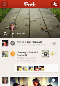
In the mobile startup tradition of quick product iteration, Path Two has hit the app store this evening — expanding beyond photosharing to people, place, music, chat and sleep mode sharing. Path founder Dave Morin says that the second phase of Path is about giving people a place to “capture all the experiences” on their path through life.
The existing Path UI on iOS and Android has been completely revamped (beautifully) and is basically a multimedia timeline. You can right swipe for settings, left swipe to add friends, and swipe down to view your own or your friends’ Paths. To initiate a Path post, click on the + button in the left corner and out pop six option icons.
Path Two lets users complete six different types of posts, competing for your sharing predilections with already existing sharing apps like Foursquare, Soundtracking, Evernote and Instagram as well as lifestyle products like Wakemate.
Morin tells me that these varied types of posts — photos, videos, messaging, songs, geolocation and sleep — were what users wanted the most when giving feedback on the original Path. Oftentimes users would add screenshots of apps like the iPod and Wakemate to their Paths, in order to expose the people following them on Path to a wider variety of content.
Users seeking (a bit more) attention can share their Paths with 150 people now, instead of the famous 50 — a change the company enacted six months ago but never really publicized. You can also sync your Path posts with Twitter, Facebook, Foursquare and inevitably Tumblr.
Sticking with the whole “life journal” theme, users can also chose not to share at all by clicking the lock button at the bottom of the screen when they post. “It wouldn’t be a very good journal if you couldn’t keep things to yourself,” Morin tells me.
In a novel feature for the life-sharing apps, the new Path will also automatically post your location (“Arrived”) every time you travel a distance far enough to be reached by plane. You can turn the Automatic feature off by going to Settings > Neighborhoods. This setting fits into Morin’s conception of Path as a “journal that writes itself.” The concept of Visit, or when someone you follow sees something on your Path, is also amped up by Path’s signature emotions and iOS 5 notifications in the new version.
In addition the paid photo and video filters already existant in Path One, this new Path opens up the possibilities for future revenue streams, including referral fees from iTunes, which streams the 30-90 second songs available for posting.
The one million or so people who have downloaded Path will be onboarded to the new version as soon as they update the app in the Apple store. In its latest incarnation, the company now competes with startups like Memolane and Memento and even Facebook’s Timeline, “We’ve always been a Path, we just think this is a more authentic representation of that,” Morin says.
You can find Path in the App Store here or by searching for Path in the Android marketplace.

No comments:
Post a Comment